Which European Nations Are Overrepresented in the History of Science?
Here I investigate whether the differences in number of notable people across Europe can be attributed to differences in population sizes.
In an earlier blog post, I tracked the European geographical distribution of over 5,000 notable people in science born between 1000 and 1850 AD. I have also animated its progression throughout this period. It was clear that certain regions had many notable people and other regions had few. Particularly Paris and London stood out as beacons of notability. A common question came up: can this pattern simply be explained by population size differences? After all, with more people you should get more notable people. My previous blog post did not intend to address this question, nor any other question pertaining to why certain regions had many notable people and others fewer.
To address this question here, I downloaded datasets which track the historical populations of urban locations and nations. To calculate the per capita rates, I use a rather simple approach of simply dividing totals by the 1850 population estimate.1
A map displaying the national rates of notable people can be seen below:
There almost appears to be a vertical line splitting Europe in two parts. One part that includes Germany and Italy and countries to their west, and the other part consisting of countries to their east.
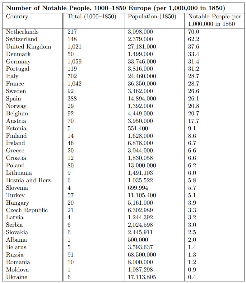
A table of European national per capita estimates can be seen below (including only countries with populations of at least half a million):
The countries that have a high total number of notable people (Germany, France, United Kingdom and Italy) do so because they combine their large populations with high per capita rates.
There is no doubt that the picture changes to some extent once population size is accounted for. Some smaller countries — Netherlands, Switzerland and even Denmark — suddenly stand out with high per capita rates of notable people, a fact that might be missed if one only looks at total numbers rather than per capita rates.
However, it is also clear that the lack of notable people elsewhere cannot simply be attributed to differences in population size. Especially eastern parts of Europe have low rates of notable people, not just low totals. Note that even some of the countries with large populations manage a per capita rate of over 30 per million, whereas many eastern countries have below 5 per million. These errors seem too large to be plausibly explained by some methodological concern, e.g., misestimations of population sizes.
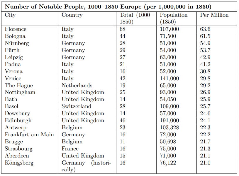
I also calculated per capita rates for cities by tallying everyone born within a small distance of the city’s coordinate and dividing by the 1850 urban population estimate. The 20 cities with the highest rates are shown below (including only cities with population estimates of at least 50,000 in 1850):
Many of these cities are not surprising, being of major cultural and economic importance. Florence is often said to be the birthplace of the Renaissance. Bologna, Leipzig, and Padua are homes to some of the oldest universities. Basel, the cultural capital of Switzerland, is the homeplace of the great mathematicians like the Bernoulli family and Euler.
To return to the initial question: can the number of notable people in a region simply be explained by its population size? There can be no doubt that population size is of major importance, but this analysis suggests clearly: no, the pattern can far from entirely be reduced to differences in population sizes. Regions differ not just in their total historical count of notable people, but their per capita rates of notability. These differences are also not insignificant in magnitude.
With population sizes changing throughout time and incomplete data, there are several approaches one can use to estimate per capita rates, each method having pros and cons. I have tried variations of this method, including, e.g., using the population estimate at time of birth of each person to calculate per capita rates. However, while the details change, the big picture remains pretty constant. So I chose to stick to this simple method for ease of understanding.


Given the bloody history of Eastern Europe this map comes of no surprise. More interesting would be a look into the correlations between notable people and historical GDP.
Funny enough, the low-genius-density/lower-performing areas of poland are actually disproportionately the areas they got from germany after WW1. Here's how things were from 1901-2018, which also seems to roughly line up with your pre-1850 heatmaps:
http://baryon.be/nobelprize/