Geographical Distribution of Ancestry in the U.S.
This post illustrates the geographical distributions of self-reported race, ethnicity and ancestry in the United States.
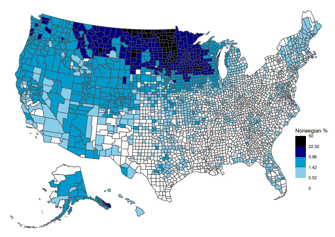
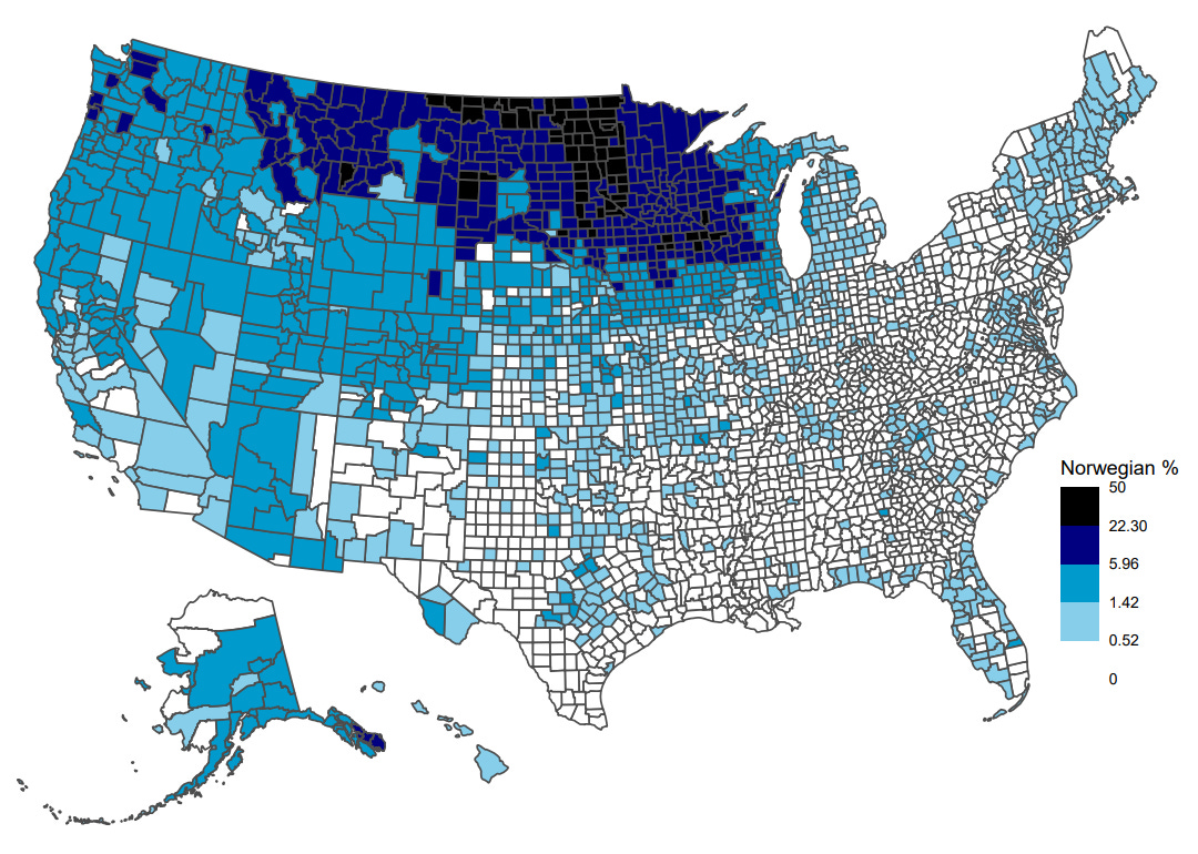
In the United States, demographic statistics are often reported and discussed at the state level. But counties, totaling more than 3,000 nationally, represent a finer geographical unit than states do. Analyses and visualizations at the level of counties are often more illuminating and, in my opinion, more visually appealing. This post does nothing more than to simply visualize the geographical distributions of race/ethnicity and ancestry (based on the decennial 2020 census and 2020 American Community Survey 5-year estimates, respectively). An example of self-reported Norwegian ancestry can be seen below.
An illustration of the fraction who self-report Norwegian ancestry across counties in the U.S.
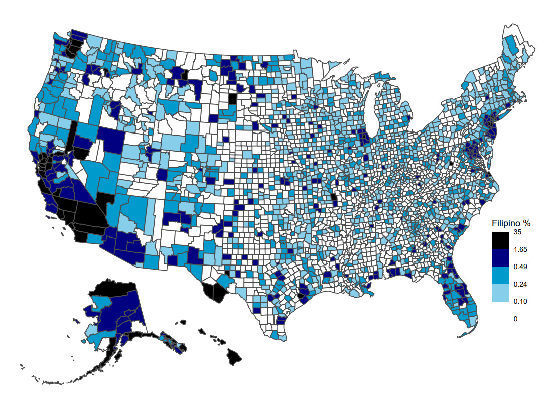
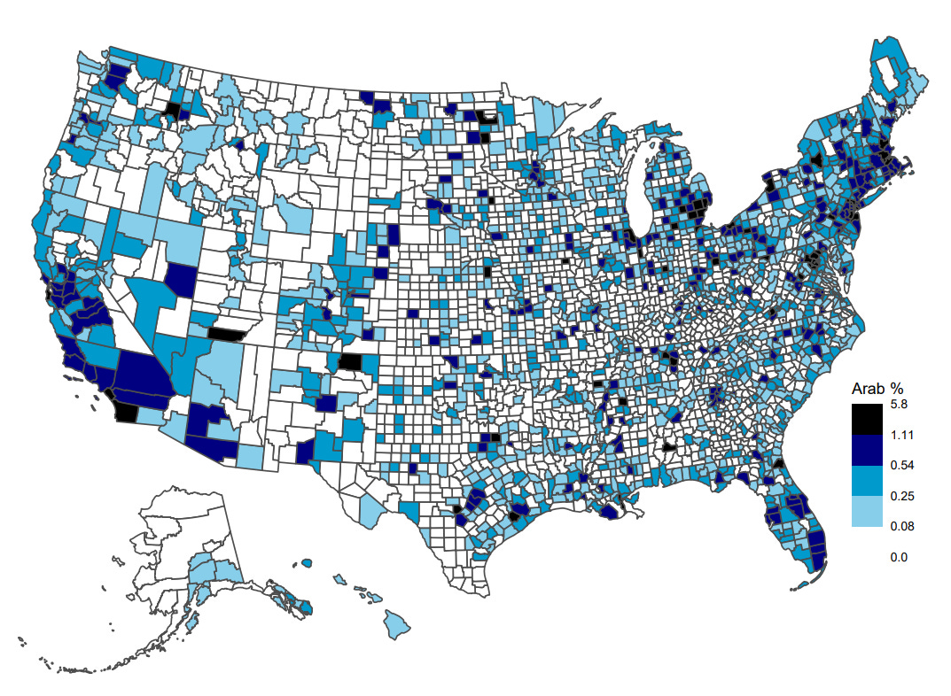
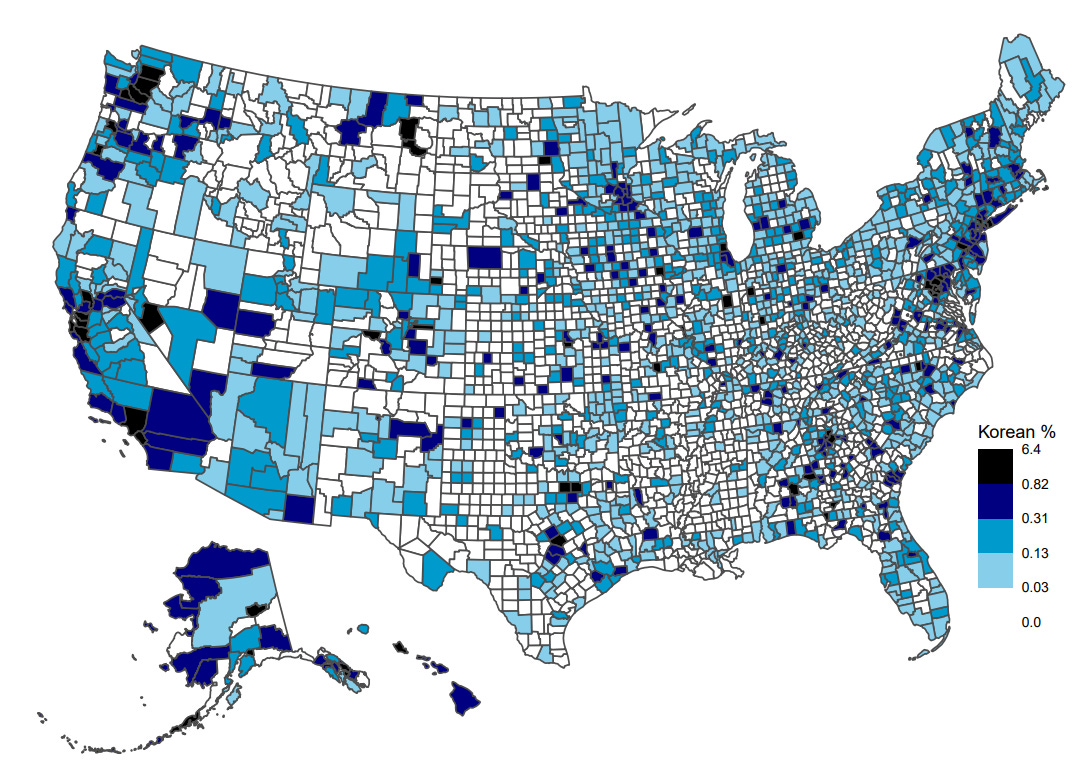
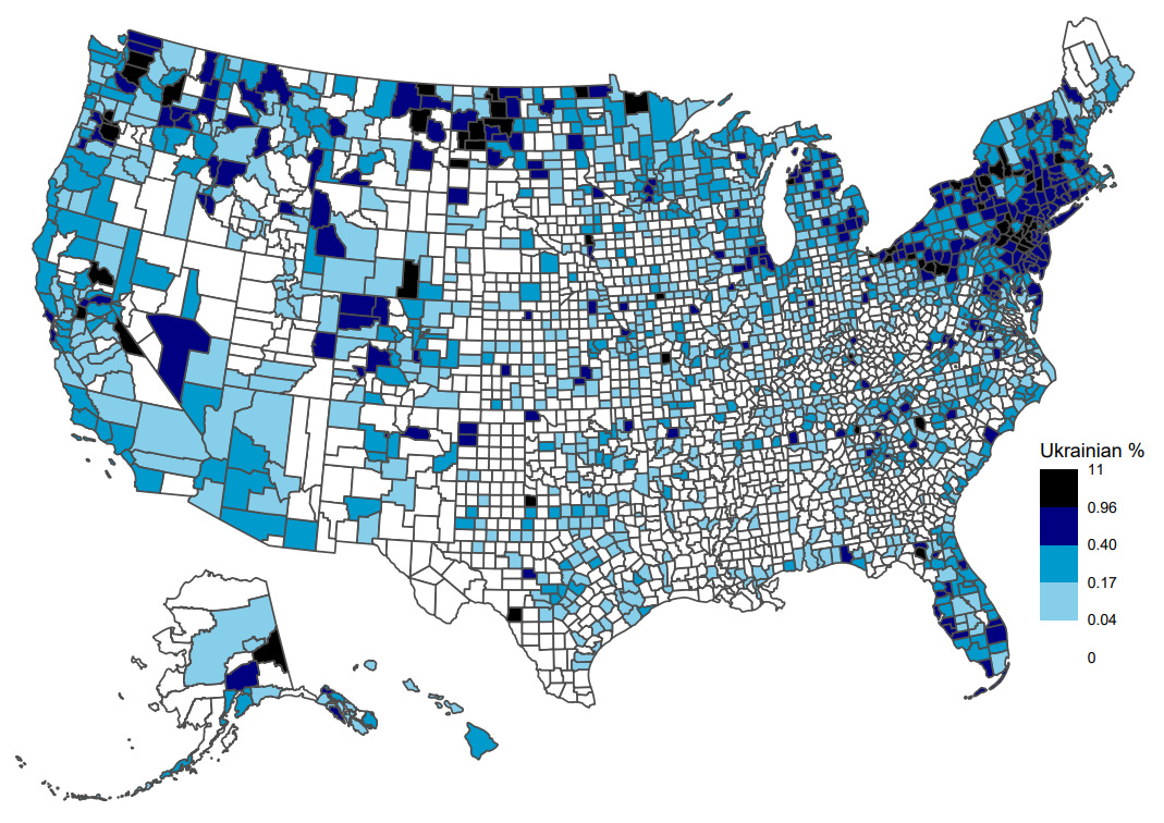
All the plots in this post are colored using the same rule, including the example above that shows the share of people who self-report Norwegian ancestry. Namely, the colors in all the plots represent certain percentiles:
0-50th percentiles: colored white. I.e., the 50% of counties with the lowest share of the group in question.
50-75th percentiles: colored light blue.
75-90th percentiles: colored blue.
90-98th percentiles: colored dark blue.
>98th percentile: colored black. I.e., the 2% of counties with the highest share of the group in question.
What number of self-reports a percentile corresponds to depends primarily on how populous the group in question is. Take the previous plot of self-reported Norwegian ancestry as an example. In 50% of all counties (0-50th percentiles), visualized in white, less than 0.5% of people self-report Norwegian ancestry. The top 2% counties (98th percentile), visualized in black, are counties where more than 22% of people self-report Norwegian ancestry. For groups that are more populous than Norwegian Americans, these percentiles will generally correspond to greater demographic shares. The thresholds that distinguish certain colors can be seen to the right in the plot.
Race and Ethnicity
The following numbers are based on the most recent (2020) census. In the U.S. national census, the only recorded ethnicity is Hispanic/Latino. Race is any one or multiple of chosen categories (e.g., White, Black or African-American).
Non-Hispanic White (191.7 million people)
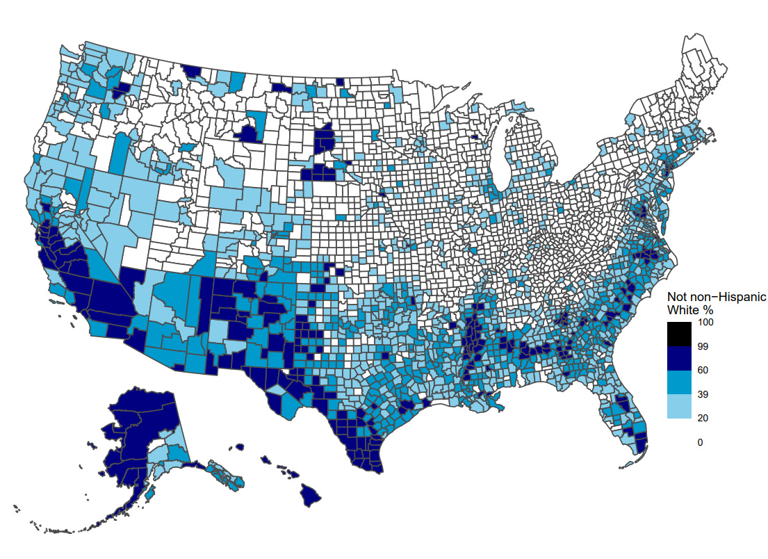
First, we start with the largest group, non-Hispanic white. The counties filled with any color are those counties where more than 80% of the population is non-Hispanic white (80% represents the median across counties). Note that, since non-Hispanic whites represent the majority of the population, they are still the majority in many of the unshaded counties.
Everyone except non-Hispanic White (139.8 million people)
Since non-Hispanic whites are the majority, it arguably makes more sense to plot the geographical distribution of those who are not that.
Black or African American (39.9 million people)
Black Americans are disproportionately clustered in an area towards the southeast in a region sometimes called the “Black Belt,” and which overlaps a lot with the Bible Belt.
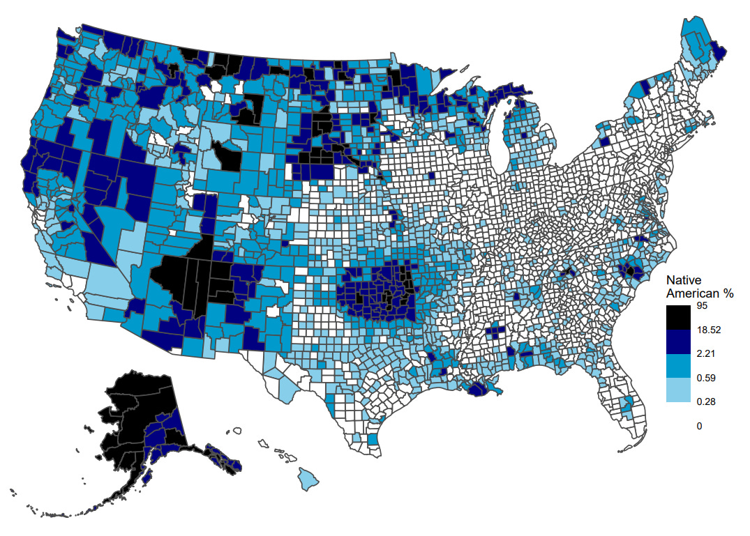
American Indian and Alaska Native (2.3 million people)
Native Americans represent a much smaller fraction of the overall population than the previously mentioned groups. Thus, the percentiles correspond to smaller fractions of the overall population. In the darkest blue counties >2% self-report as Native American and in counties colored black more than 18% do.
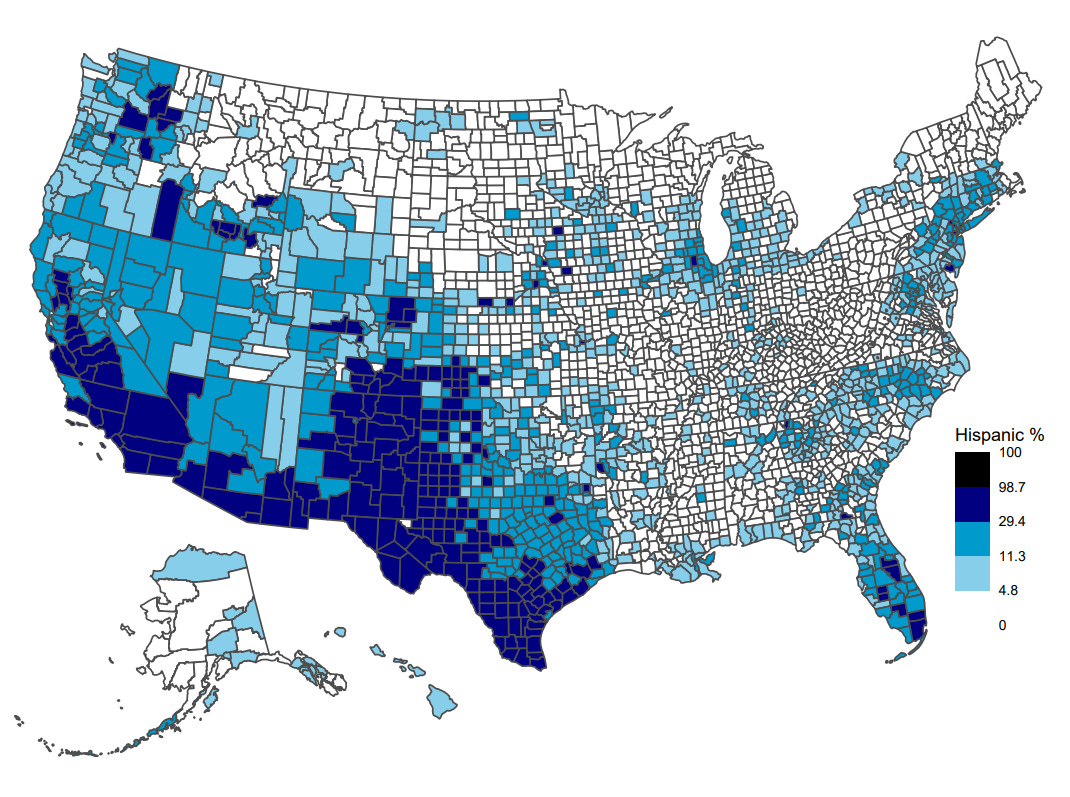
Hispanic or Latino (62.1 million people)
The darkest blue counties are those where 29.4% or more of the population self-report as Hispanic or Latino. They are clustered primarily in southwestern counties.
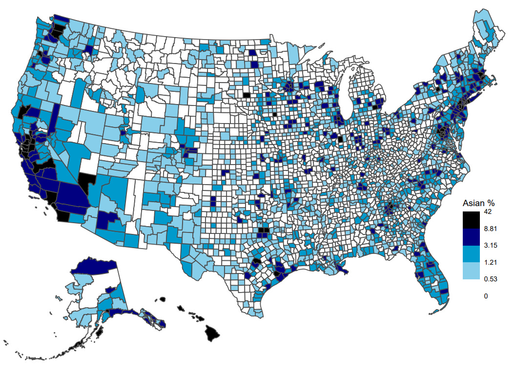
Asian (19.6 million people)
The Asian population is relatively small, although larger than the self-reported Native American population. Unlike the less numerous Native Americans, however, there are no counties where the Asian population represents a majority.
Ancestry
Next I plot ancestries, excluding ancestry groups that have less than one million people self-reports. Sorted by population size, starting with German, the largest self-reported ancestry group. These numbers are based on the 2020 American Community Survey 5-year estimates.
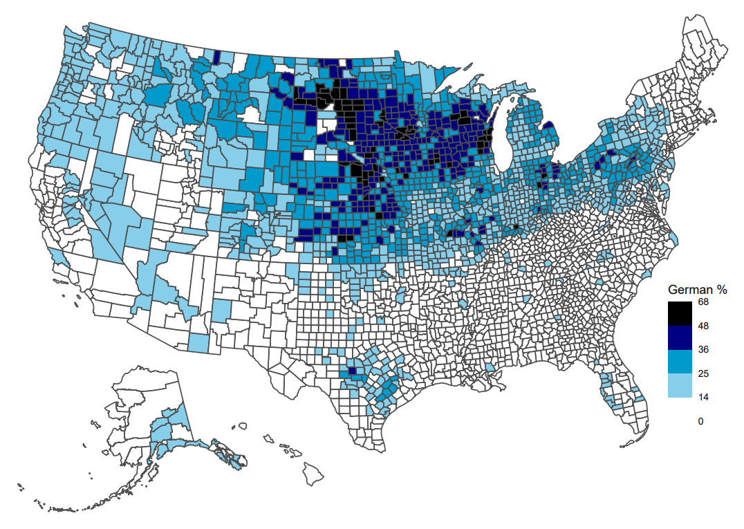
German (42.6 million people)
German Americans are the largest of the self-reported ancestry groups in the country, and they live in greatest numbers in the northern parts of the country, particularly the West North Central states.
Irish (31.5 million people)
With 31.5 million people reporting Irish ancestry in the U.S., this far exceeds the population of Ireland itself (about 5 million). Many Irish people emigrated to the USA in the 1800s following the famine in Ireland caused by potato blight.
English (25.2 million people)
Self-reported English ancestry is one of the largest ancestry groups, situated disproportionately in New England to the northeast and the western regions of the country.
Italian (16.6 million people)
Polish (8.9 million people)
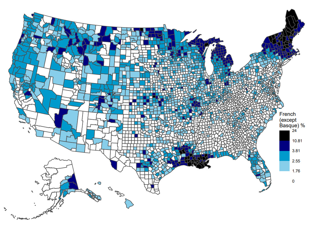
French, except Basque (7.4 million people)
People with French ancestry (including French Canadians, shown later) tend to live to the northeast, bordering Quebec in Canada. Additionally, many with French ancestry live in Louisiana following the expulsion of the Acadians.
Scottish (5.3 million people)
Norwegian (4.3 million people)
Chinese, except Taiwanese (4.2 million people)
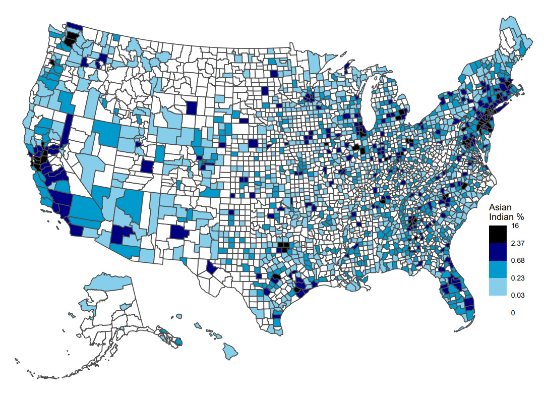
Asian Indian (4.1 million people)
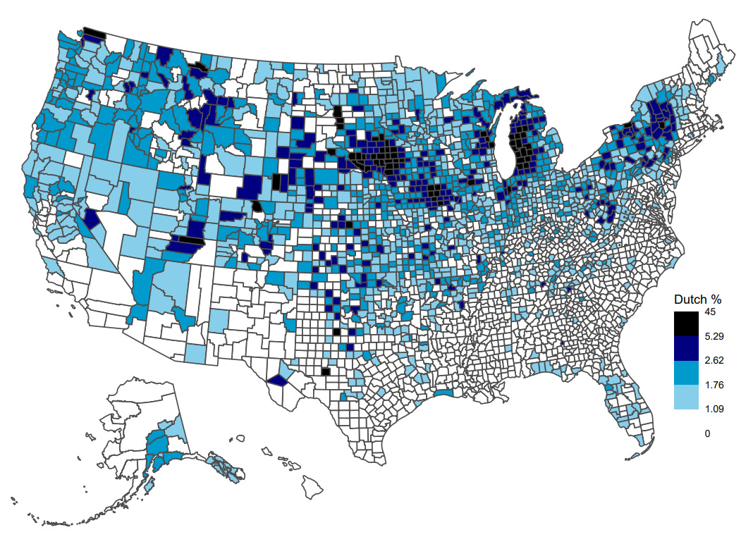
Dutch (3.7 million people)
Swedish (3.6 million people)
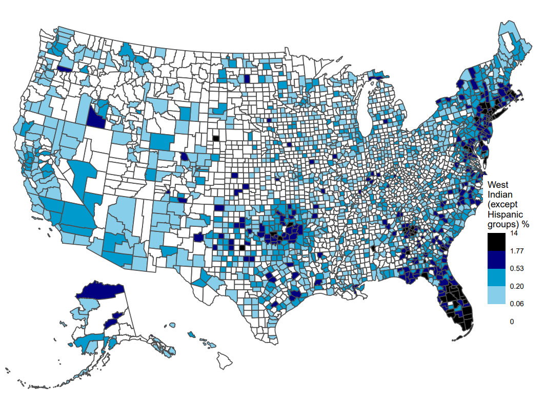
West Indian, except Hispanic groups (3.0 million people)
People with ancestry from the West Indies (including Jamaica and Haiti which will be displayed later) live in greatest numbers in the state of Florida.












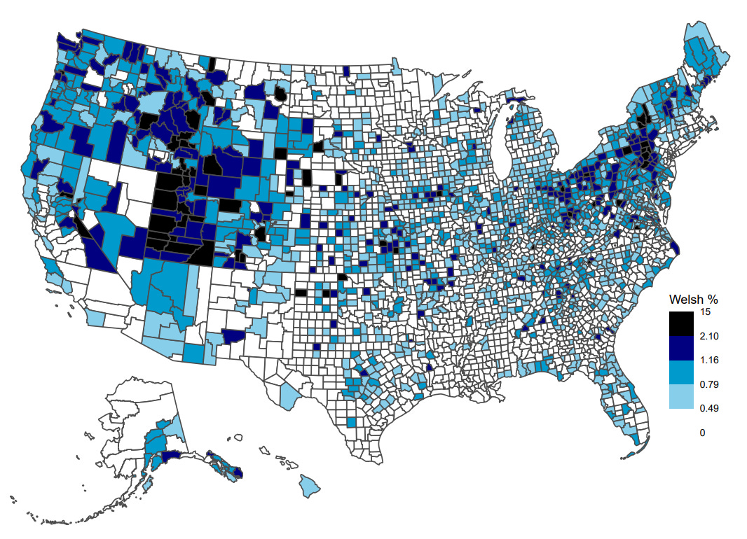
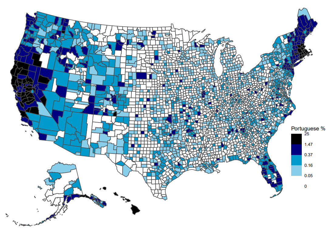

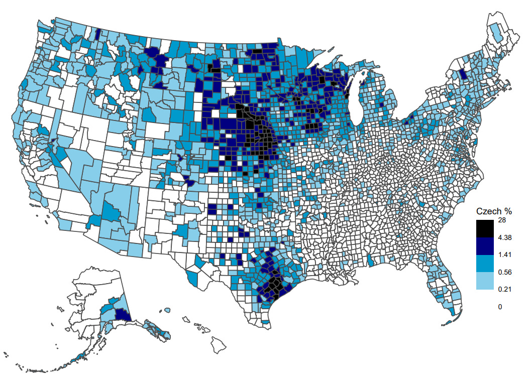

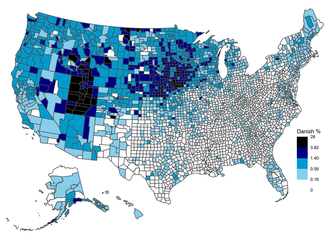

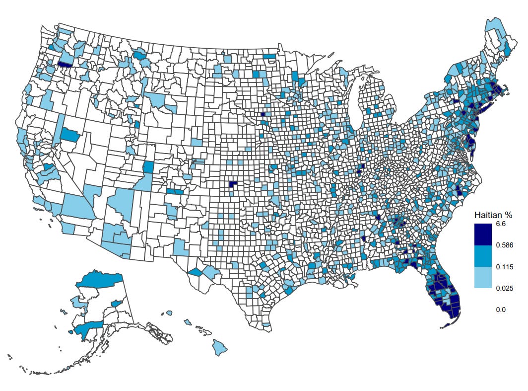
Interesting how Utah is is similar to New England. Also how it houses a significant Welsh and Danish population. The latter I would have never thought of